
If you have an interest in silent film — and it’s doubtful you would be reading this if you didn’t — and you have had the opportunity to see one that has been restored to a state approaching its original release, and properly presented, you know that they are not “silent” and were almost never presented without music in a theatrical setting. They were also not uniformly black and white. Many films, some in their entirety, simply radiated color — some natural, some garish, bright and intense, others so subtle their effect is almost subliminal.

We tend to think of motion pictures or motion photography (which is what it was called in the industry and the trade press well into the 1910s, “movies” being considered an awful slang name) as simply being an extension of still photography. But aside from sharing the basic principle of exposing a light-sensitive surface to light focused through a lens, still photographers and motion picture photographers or cinematographers had surprisingly little else in common when it came to practicing their craft or their art. This was largely due to the method of presenting the finished product. Photographic still portraits were sometimes color-tinted, but not routinely, there wasn’t a demand for it. But magic lantern and slide shows depended on color to enhance their presentation to an audience to make the images seem more life-like. The same happened very early on with motion photography — Edison, the Lumieres and Melies all used color to a degree, and well before 1900.
, Celio, 1914, Dir: Nino Oxilia.") Until very recently, film students were taught the “early classics” by screenings of blurry black and white prints of “A Trip to the Moon” from Melies in 1902 and “The Great Train Robbery” by Edison and Porter from 1903. Original prints of both were colored frame-by-frame manually, and not just a monochrome entire frame, but individual elements — garments, props, sets, backgrounds and so on. But these were expensive to make, and to duplicate when more prints were needed, particularly in the wake of the phenomenal success of both films. Thus the black and white prints were the ones seen by most people over time and the originals were “lost,” or so it was believed, for years. (Perversely, tinted sequences were often made on a different film stock from the standard black and white, and proved to be less durable and thus subject to an accelerated disintegration.)
Until very recently, film students were taught the “early classics” by screenings of blurry black and white prints of “A Trip to the Moon” from Melies in 1902 and “The Great Train Robbery” by Edison and Porter from 1903. Original prints of both were colored frame-by-frame manually, and not just a monochrome entire frame, but individual elements — garments, props, sets, backgrounds and so on. But these were expensive to make, and to duplicate when more prints were needed, particularly in the wake of the phenomenal success of both films. Thus the black and white prints were the ones seen by most people over time and the originals were “lost,” or so it was believed, for years. (Perversely, tinted sequences were often made on a different film stock from the standard black and white, and proved to be less durable and thus subject to an accelerated disintegration.)
 While it is difficult to determine precisely how much film of the silent era was tinted or toned with varying hues, it was a practice of filmmaking both widespread and systematic. From the earliest hand coloring of individual frames by Edison and Melies, to the elaborate stenciling processes, color was rampant in silent film. (“Toning” refers to an entire film or sequence within a film dyed in a single color; “Tinting” refers to multiple colors on individual frames after exposure. Confused? Welcome to the club — you’ll often find the terms used interchangeably.) Not until the early 1920s was a color photographic process used to give natural color to an entire “feature-length” film. But long before color photographic processes, toned and tinted film was used to indicate time, place, mood and more, sometimes according to an actual scheme to advance the narrative of a film. Nowhere was this more elaborately done than in Italian silent film from 1906 up to the late 20’s and early Technicolor. And no genre of Italian film did so as boldly and with as much panache as diva film.
It’s not my intent to try to explain the specific color scheme in particular films (assuming I could figure them out which would require access to a complete color print in the first place), or the various laboratory methods employed. In many films of this period, only odd reels or smaller fragments are known to exist. But even a single frame can be appreciated for its beauty as a photograph, without movement or sound.
, 1915, Dir: Giovanni Pastrone.") It has been my intent with these illustrated essays to pay at least as much attention to the images that accompany the words as the words themselves. In the process, I’ve accumulated thousands of images from hundreds of films for the still frames that I’ve used in these articles. Many are so striking that I’d like to share them, rather than have them languishing on the odd external hard drive or dvd-r. Two earlier posts dealt with the frame compositions of D. W. Griffith/Billy Bitzer and an assortment of “classic” early film still frames. The latter in particular gave more space to color tinted, toned and stenciled films, including a few from early Italian film, which is the focus of this essay.
It has been my intent with these illustrated essays to pay at least as much attention to the images that accompany the words as the words themselves. In the process, I’ve accumulated thousands of images from hundreds of films for the still frames that I’ve used in these articles. Many are so striking that I’d like to share them, rather than have them languishing on the odd external hard drive or dvd-r. Two earlier posts dealt with the frame compositions of D. W. Griffith/Billy Bitzer and an assortment of “classic” early film still frames. The latter in particular gave more space to color tinted, toned and stenciled films, including a few from early Italian film, which is the focus of this essay.
 Four of my last six posts have been on early Italian film (if you’re waiting for something different, don’t worry, I’ll be shifting gears again within a few weeks), and in preparing those, I’ve had to choose from thousands of images, far too many to ever use. Although some of these have been selected from films or sequences of films that I will cover in future articles, and some are from sequences used in prior posts, the majority are likely ones I won’t use in the future, especially those of uncertain origin but yet still deserving of display in their own right.
 Note: I have not altered any of the color hues in these still frame images. However, I did have to reduce the color saturation on some images (mainly the single color or monochrome images) after I reduced their size to fit the pages here due to the over-saturation that occurs when images are reduced in size from the original still frame capture. This allows me to maintain the proper color intensity of the original which would otherwise be unacceptably distorted.
 The Italian branch of Pathe, Film d’Art, produced dozens of one reel adaptations of classic literature, Shakespeare in particular. At top right, two frames of Re Lear (“King Lear”) from 1910, directed by Gerolamo LoSavio, starring Ermete Novelli, a star of Italian stage, as the King in exile; note that only faces remain black and white
 in Re Lear (\"King Lear\"), 1910.") At right, the King chastises his only faithful child, Cordelia, played by Francesca Bertini. Bertini had only recently been signed to a film contract by Film d’Art after attracting notice in a stage production of Oscar Wilde’s Salome. Bertini would make about two dozen one reel films for Film d’Art before signing with Celio of Rome in 1912, making longer, 2-3 reel dramas.
At right, the King chastises his only faithful child, Cordelia, played by Francesca Bertini. Bertini had only recently been signed to a film contract by Film d’Art after attracting notice in a stage production of Oscar Wilde’s Salome. Bertini would make about two dozen one reel films for Film d’Art before signing with Celio of Rome in 1912, making longer, 2-3 reel dramas.
 in Re Lear (\"King Lear\"), 1910.")
, 1917.") Francesca Bertini and Gustavo Serena (at left). They were first paired in 1910 in a one reel “Romeo and Juliet,” by Film d’Art, and in 1915 they co-starred and co-directed Assunta Spina: to my knowledge, a feat never duplicated. They starred in several more films together, including Il Processo Clemenceau (“The Clemenceau Case” in America) in 1917, an early study of infidelity and divorce, a scandalous topic for the time. This pastoral, green setting is one of the calm moments in an otherwise tempestuous tale.
Francesca Bertini and Gustavo Serena (at left). They were first paired in 1910 in a one reel “Romeo and Juliet,” by Film d’Art, and in 1915 they co-starred and co-directed Assunta Spina: to my knowledge, a feat never duplicated. They starred in several more films together, including Il Processo Clemenceau (“The Clemenceau Case” in America) in 1917, an early study of infidelity and divorce, a scandalous topic for the time. This pastoral, green setting is one of the calm moments in an otherwise tempestuous tale.
, 1917.")
The red and fiery orange tinted sequence as seen in the frames below from “Clemenceau” are indicative of stormy times ahead, I presume . . .
, 1917.")
, 1917.")
, 1917.")
And the green tinting of this sequence gives the impression that the cup from which Francesca drinks is something less than healthful? Maybe poisonous? (Note: this is one of the frames that I did not correct for color over-saturation — compare it to the corrected image of the previous “green” tinted frame from the same film, above.)
 At Right: Blue might also be the color of passion — well, these are Italian films after all, passion knows no restrictions on color, of all things. Here, Lyda Borelli is about to lock lips with a little-too-old-for-her lover.
Below Right:  Elena Makowska awaits her fate in Caino (1918), a variation of the story of Cain and Abel. Makowska, born in 1893 in what is now Poland (then the Russian Empire), was one of several Eastern European actresses who had successful, if short, film careers as “Russian” divas of Italian silent film.
Below left: Makowska makes love on the balcony, a dicey proposition in diva film — shades of “Paparazzi” ala Lady GaGa. Below right: Pina Menichelli and Febo Mari enjoy a pastoral moment in Il fuoco (“The Fire”), in blue rather than the typical green or yellow for such a scene.

, 1915, Dir: Giovanni Pastrone.")
, \"La Storia una Donna\" (The Story of One Woman), 1920.") Above, pinks and whites for a “celebration,” maybe New Year’s Eve or a wedding. Pina Menichelli at right in La Storia d’una Donna (“The Story of One Woman”), 1920.
Above, pinks and whites for a “celebration,” maybe New Year’s Eve or a wedding. Pina Menichelli at right in La Storia d’una Donna (“The Story of One Woman”), 1920.
Below, a striking contrast of multiple colors in Rapsodia Satanica (“Satan’s Rhapsody”), 1915, and completely different tonal qualities: Drab during the scene where the elderly Lyda Borelli makes a pact with the devil, bright for a party scene after she has “regained” her youth.
, 1917.") [I’d love to show more images from this incredible film, but I’m saving them for a full post on Rapsodia Satanica.]
[I’d love to show more images from this incredible film, but I’m saving them for a full post on Rapsodia Satanica.]
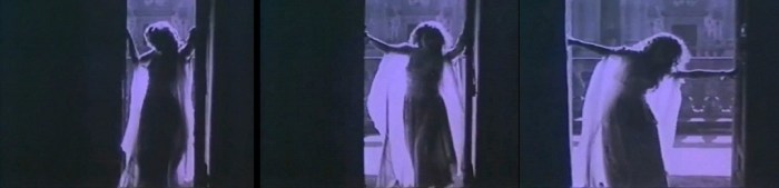
 No sleep in the deep purple for Francesca Bertini . . .

, Cines 1916, Dir: Giovanni Pastrone") Blue, self-absorbed Countess; Pina Menichelli (Tigre Reale, 1916).
Blue, self-absorbed Countess; Pina Menichelli (Tigre Reale, 1916).

 Francesca Bertini keeps a close eye on her men with style (and red/yellow end of the color spectrum).

, 1914, Dir: Nino Oxilia.")
In an era where hats were a crucial element of female fashion, no one wore them with more panache than La Bertini . . .

, Cines 1916, Dir: Giovanni Pastrone") Unless it was Lyda Borelli (Carnevalesca, 1918) . . . or Pina Menichelli (Tigre Reale, 1916).
Unless it was Lyda Borelli (Carnevalesca, 1918) . . . or Pina Menichelli (Tigre Reale, 1916).
, Dir: Carmine Gallone.")
, Dir: Carmine Gallone.")
Pale blue eyes see through pale blue glass; things she’d rather not have seen . . . Lyda Borelli, La Donna Nuda (“The Naked Woman), 1914.
, 1919.")
, 1919.")
Deep blue, sadness, death, inconsolable loss. Francesca Bertini, La Piovra (“The Octopus”), 1919.
[My next post will continue to trace the story of diva film in early Italian cinema muto, continuing from where it was left in the previous post, “Dawn of the Diva.”]
")
